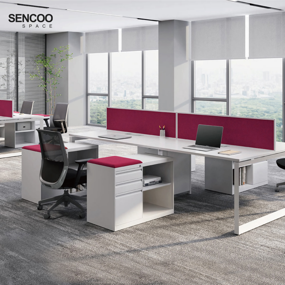
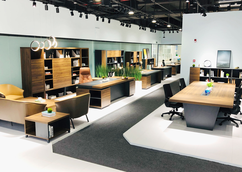
The color scheme of office furniture not only affects the overall aesthetics of the space but also subconsciously influences employees’ mood, focus, and creativity. Choosing the right colors can enhance workplace comfort, promote teamwork, and even strengthen corporate branding.

1. Office Size & Color Selection
(1) Small Offices
Recommended: Light shades (white, beige, light gray)
Effect: Visually expands space, avoids a cramped feel
Avoid: Overuse of dark colors, which can make the room feel smaller
(2) Large Workspaces
Recommended: Deep tones (navy, emerald, charcoal) + bright accents
Effect: Adds depth, prevents an empty or cold atmosphere
Avoid: All-white or all-light schemes, which may feel bland
(3) Low-Light Offices
Recommended: Warm white, beige, light yellow
Effect: Brightens the space, reduces gloominess
Avoid: Cool grays and dark hues, which can make the room feel darker
2. Aligning Colors with Corporate Branding
(1) Match primary colors to brand identity (e.g., Coca-Cola’s red, IBM’s blue)
(2) Neutral backdrop + brand-colored accents (e.g., Google’s colorful furniture + white walls)
(3) Gradient or contrasting schemes for a bold look (ideal for youthful brands)
The ideal office color palette balances functionality and aesthetics by aligning with work requirements (e.g., blue for focus, yellow for creativity), industry standards (neutral tones for professionalism, bright accents for innovation), and spatial dynamics (light colors to expand small spaces, deep hues to add depth).

